Unilever: Ever counted the hidden meanings in ‘U’?
When you are in a mall to pick personal care products, food ingredients and beverages, cleaning agents, soaps or such FMCG products, many of them you pick from the shelves has the Unilever’s ‘U’ stamp on it. It means a lot in business- it states the prominent brand presence of Unilever. Unilever is a massive manufacturer of products with above 400 Brands and has more than five hundred companies in it’s group across the world. Brands that live with all of us like ‘Lux’ to ‘Lipton’, ‘Bru’ to ‘Brooke Bond’, ‘Ponds’ to ‘Pepsodent’, ‘Closeup’ to ‘Clinic Plus’, ‘Sunsilk’ to ‘Surf’, ‘Lakmé’ to ‘Lifebuoy’, ‘Dove’ to ‘Domex’ … and many such well-known brands are from Unilever. I’m sure some of the Unilever brands are certainly playing a living-in-relationship in your life too!
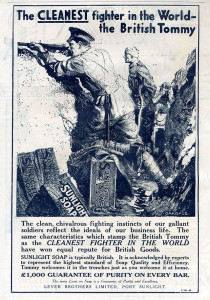
 In the 1880s, William Hesketh Lever from UK, the founder of Lever Bros thought of an idea for a soap which would populorise the necessity of cleanliness and hygiene in Victorian England. The thought was transformed into reality in 1884 with the introduction of the revolutionary new product, “Sunlight Soap”. This was the first packaged, branded laundry soap in the world.
← an Advertisement by Sunlight during 1915 in the World War I background
Unilever was founded in 1933 by a merger of ‘Lever Brothers’ and Dutch margarine producer ‘Margarine Unie’ (In English: Margarine Union Limited). As the result of this merger, ‘Unilever‘, the coined-word was derived by combining ‘Uni’ of ‘Margarine Unie’ along with the ‘Lever’ of ‘Lever Brothers’.
Today, Unilever is one of the world’s biggest companies. The firm has a dual establishment of ‘Unilever N.V.’ based in Rotterdam, Netherlands and ‘Unilever PLC’ based in London. The firm got it’s penetration in the Middle East and North America during 1933. It’s in the same year, it has entered the market of Egypt too. Unilever being one of the world’s leading manufacturers and marketers of Fast Moving Consumer Goods, it sets subsidiaries in different countries to create strong local roots. For instance, ‘Hindustan Unilever Limited (HUL)’ is a subsidiary of Unilever in India. Through different continents, regions, languages and cultures, Unilever has continuously offered energy to its markets with the corporate mission to ‘add vitality to human life’.
The story weaved along the brand:
One big reason that hook your attention on the labels of the Unilever products is it’s captivating logo. Let’s decipher the history and the hidden meaning of Unilever logo.
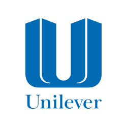
1969 – 2004: Unilever Old Logo
The first logo of Unilever was launched in 1969 and was the design of a twin-towers-like-figure to create a gigantic ‘U’. During the turn of the 20th century, Unilever wanted to promote their corporate image more prominently on their products, and felt that the logo wasn’t friendly enough to penetrate deep into the consumers’ minds .
Unilever New Logo: 2004 onward
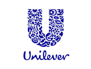
In 2004, Unilever launched a new logo worldwide, as part of the company’s 75th anniversary celebrations. The new logo contains a big letter ‘U’ which is made up of 25 icons which represent various aspects of the company’s activities, products and ideology it shares with the communities the company deals with. “Unilever” is written in a script font underneath. This unique ‘U’ is designed by the brand consultancy ‘Wolff Olins’, based in London. It’s an idiosyncratic combination of 25 unique arts woven beautifully to create a ‘U’ shape. The icons incorporated in this distinctive design are Sun, Hand, Flower, Bee, DNA, Hair, Palm Tree, Sauces /Spreads, Bowl, Spoon, Spice/Flavors, Fish, Sparkle, Bird, Tea, Lips, Ice cream, Recycle, Particles, Frozen, Container, Heart, Clothes, Wave and Liquid. Each of these 25 icons is representing company’s brands, products and values. The brand theme was developed around the idea of ‘adding vitality to life’.
What do these 25 spectacular parts of ‘U’ mean? Let’s look into..
U is not just an alphabet, but a blend of diversified brands and values for Unilever. It’s also a reflection of plethora of products and the benefits it offers to their consumers.
Sun: Sun is the primary natural resource considered by Unilever as ultimate symbol of energy. In addition, there are many products and brands that relates Unilever to Sun. Brands like Flora, Omo, Slim-fast etc. use Sun’s radiance to communicate their benefits.
Bee: Bee is placed as a device to depict various aspects from bio-diversity, pollination, creation and hard work. All the opportunities and environmental challenges energize the firm and expand the diversity far and wide.
Hand: The products that relate to touch and skin are depicted through this icon. The hand is a symbol of care, need and sensitivity.
Flower: Flower has always been the symbol of fragrance. The icon flower is pictured beside the hand to showcase the perfumery and skin care products.
Hair: Hair is a symbol of good looks and beauty. The most alluring part of the icon is its position next to the flower. Beauty, fragrance and cleanliness just placed beside the hand icon are the best part of the logo.
DNA: The double helix of the DNA depicts the bio science and life. The way towards Unilever’s products that aim for a healthy life. According to the firm which created the logo, the Sun is the prodigious part of life and DNA, the iota.
Palm Tree: A palm tree is one of the versatile icon means many products. It is not just used to produce oil, dates and also used in making homes. It also signifies the tale of paradise.
Sauces: Sauces are inevitable part of tasty foods. The icon reflects mixing of tastes and creating the magic of flavors.
Bowl: It is not just a bowl, but a bowl of appealing food that sprouts out the deliciousness in the air. What do you think it can be? Ready to eat meal? A hot soup or a coffee?
Spoon: The icon depicts nutrition, food, healthy diet and of course the products that are used for cooking.
Spices and flavors: Unilever sells spices and versatile flavors that ought to be used for a delicious dish and thus this icon.
Fish: Just like the world of a tiny fish, it represents the vast sea and also fresh water.
Container: Do you remember the beautiful and cute little container of cold creams? Who doesn’t? The container symbolizes packaging associated with the products that are used for personnel care.
Cloths: Unilever is into production of detergents and clothing products too. The cloths symbol means fresh laundry.
Wave: The wave is a symbol of vigor. It also depicts cleanliness and freshness.
Liquid: The adorable little wave and liquid are joined together in the icon. It not only depicts the liquid products but also the fresh breath they leave behind.
Heart: Heart is the best means of presenting love. Unilever depicted the same through care, love and healthy life of their customers through this icon.
Frozen: Frozen icon is a symbol of transformation, also the frozen food-stuffs.
Tea Leaf: Tea is not just a daily refreshing drink but a significantly represents farming, growing and plantations. The icon stands for feature of creation for Unilever.
Particles: These particles are the reference towards science and fizzle.
Recycle: Unilever has always kept the promise of commitment towards the environment and the society. The recycle symbol highlights the same. It stands for the commitment towards recycling of waste for a healthy earth and a sustainable society.
Lips: What do you think lips represent? Beauty, food and taste, Unilever says .
Ice cream: A happy treat, a leisurely fun and enjoyment is this icon’s significance.
Sparkle: It is not just a sparkle but an aura of energy that bounces back healthy and hygienic life. Thus describing the hygienic products Unilever manufactures.
Bird: Remember, a flying bird feels the limitless freedom, where sky is the limit. This icon intentionally describes freedom from the chaos of life and living it better and happier.
An artistic representation means so much to it’s brand? It took around 1000 words for me to describe the artistically crafted meaning behind the ‘U’ of Unilever.
The Unilever logo has been noted by design critics as one of the most unique and acclaimed corporate designs of recent years. It is considerably a complex design, but works well with all details of the devices designed in it. This Unilever’s logo touched the intellect of millions across the globe. It charmed the eyes, made people feel seeing ‘something special’ and distinctive. Creating a logo is not just designing an art-work, it is an opportunity to create the well-knownness for it’s brands. Unilever proved it too well!
Next time when you pick a Unilever product, check it up if you could spot all the meaningful icons in ‘U’?
All Intellectual Properties referred on this website are absolutely owned by their respective owners.
2 Responses to “Unilever: Ever counted the hidden meanings in ‘U’?”
Leave a Reply
Do you have a Brand Story to say? Register, Login and post your article.
Categories
- Airlines
- Apparel
- Automobile
- Aviation
- Banking
- Beverage
- Chocolate
- Clothing
- Coffee Shop
- Computer Hardware / Software
- Confectionery
- Consumer Packed Goods
- Digital Imaging
- Document Services
- Electronics
- Entertainment
- Fashion
- Fast Food
- Film Production
- Financial services
- FMCG
- Food & Beverage
- Games / Toys
- Healthcare
- Healthcare/ Hygiene
- Internet
- IT Consulting
- Lifestyle
- Logistics
- Luxury Goods
- Mass Media
- Oil and Gas
- Petroleum Industry
- Pharmaceutical
- Processed Food
- Readymade Garments
- Restaurant
- Retail
- Social
- Social Media
- Sports Goods
- Technology
- Telecommunication
- Uncategorized
- Watch Manufacturing
Recent Posts

Thank you! for being a part of us
How do I start this note o...
Wikipedia: the world of words over the world wide web
Do you think the history has any indication tow...
Pepsi: pepping-up the spirits around
While the scorching sun pass over its feelers a...
Shell: a pearl from the ocean of oil
The firm’s name is ‘Shell’, guess the kind of a...
Barbie: the big toy-story unwrapped
Being a woman is being precious, if her sensiti...
Recent Comments
- Finance-Courses.com on Wikipedia: the world of words over the world wide web
- admin on Discovery Channel- The world is so small!
- topi handmade on Facebook: the story of a billion dollar faces and a billion likes!
- credit repair forum on Discovery Channel- The world is so small!
- pAYKB0J on “Google”: Is it all by a spelling mistake?


Never-before known facts about Unilever now learnt. Interestingly blogged.
‘U’ of Unilever is very unique & interesting. Enjoyed the blog very much 🙂